Vis Dev
Doctoring programmer art up with visual design techniques
Hello there,
I don’t know about you, but I’m more of a programmer than an artist. I find writing fancy shaders much easier than hand drawing sprites (pixel art is okay). Over the years, I’ve learned some tricks that helped me work with my own programmer art
Games like SUPERHOT, INK, Forager, BUZZ, OTXO, Thomas was alone, Minecraft and Inside are all great examples of well-polished games with relatively simple graphics.

Today’s tutorial is all about how visual design concepts and post-processing can improve the visuals of just about any game. Visual appeal is a somewhat subjective topic with a wide range of perspectives and opinions. I’m not here to tell you what style to use, but I would like to share concepts to consider when designing your games.
Color Palette
The first thing I’d consider is color palette. Coloring can be tricky, and it heavily depends on your vision for your game. Generally, it seems that programmers tend to use too many vibrant colors. It’s an easy mistake to make. If you’re not certain about coloring, you should probably use fewer colors. SUPERHOT and OXTO are great examples of games that use limited palettes of just 2 or 3 colors, producing a nice and consistent aesthetic. Dithering is also a great tool for stylizing some games.
Here’s an example from Eclipsium:
GM Shaders Mini: Dither
Dithering can be used for cartoon or retro stylization, or it can be used to make more expensive effects look smooth with less of a performance cost
Here, I’ve applied a range of color filters and dithering directly to my textures:
In this particular case, I went with the left most coloring by @RowanFuture. It feels quite natural and while still being vibrant and warm, but you can probably imagine other types of games where the other aesthetics may be more appropriate.
It’s also a great idea to look at your screenshots in an image editor like GIMP
GIMP shows you a “histogram” which tells you the distribution and range of pixel brightnesses. Here I’ve found that the brightest pixels seem to be capped at 195 out of 255 (about 76%). This means I could boost the brightness about 30%, and it looks much better (shown on the left). Not all games need to use the full range of values, but most look better when they do!
The same adjustments can be done with the black level, but in this case, it looks good as is.
Resolution and Scale
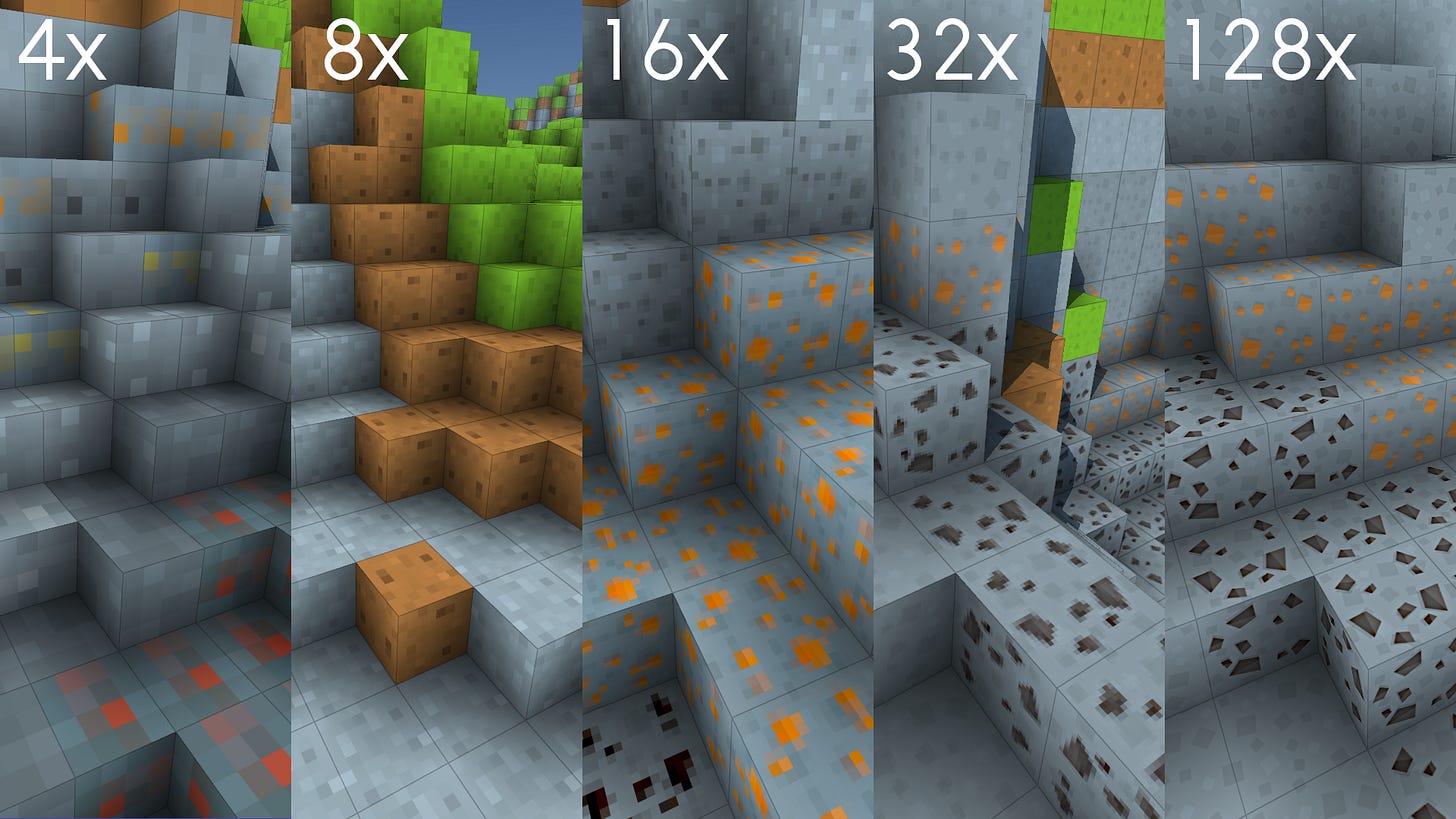
For pixel art games, it’s especially important to consider texture resolution. You don’t want to mix different pixel art scales together without a good reason. Lower resolution portrays a smaller scale and can give a fun/silly tone. If it’s too small it can be difficult to convey details, so it’s good to get an early idea of what kind of sprites you’ll need and work around that. Higher resolutions can convey a more serious or realistic tone, but may become more time-consuming to work with.

The lower resolution textures could look better with some hand adjustments, but I’m the programmer artist, so you get the picture. Try to find a texture and screen resolution that you’re comfortable working with and stick with it consistently.
Consistent scaling can make an enormous difference in your game’s perception!
Detail Distribution
Another factor I like to think about is the distribution of details in a scene. We programmers tend to focus too much on the function of the scene/objects and can miss the bigger picture. I’ve found it helpful to pay special attention to what the distribution of details. If some objects or elements of the lots of detail, we may need to add more details to the rest of the scene. A minimalistic player sprite can look out of place in a detailed world, or vice versa.
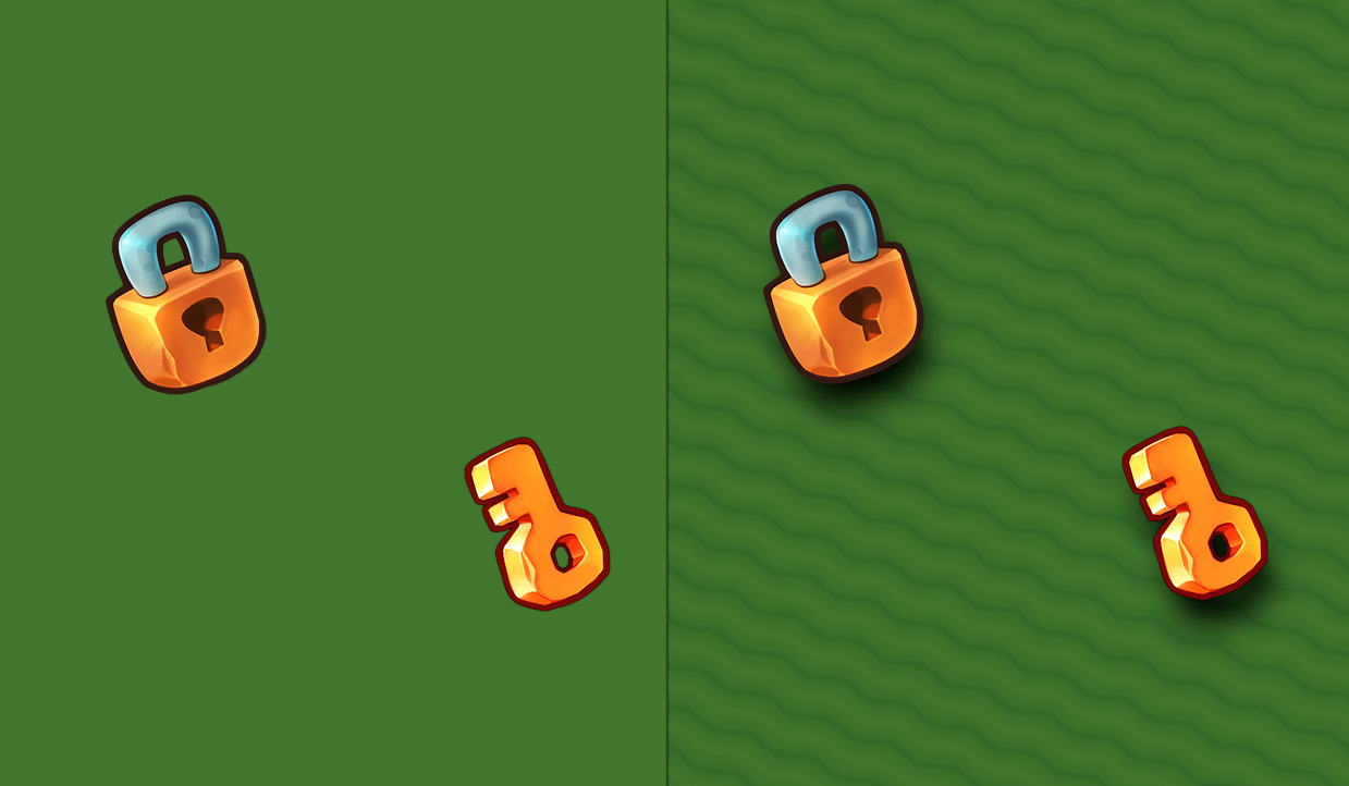
Here’s an example scene with a somewhat detailed lock and key on a plain background:
As you can see on the right, we added a soft wave pattern and some drop shadows. This helps the objects match the scene without requiring a lot of artwork. The background here is still much softer than the objects, but that’s okay. Here, we still want to emphasize the separation of the background and interactive objects, but just with a little more to look at. You could also imagine using patches of grass or other background sprites if you have those. In some contexts, you may want a Depth Of Field effect with a focus on the foreground and a blurry background.
To summarize, develop a design language for emphasizing what should be important to the player and sprinkle in some fun flavoring where it might be missing
Lighting and Shading
Lighting is super important, not just for the overall aesthetic, but also for its usefulness in directing attention where you want it. Lighting is a tool for communicating mood and atmosphere. Make sure you’re considering the many possibilities. You could use warm orange lights or cold blue/white lights. You could have soft-blue shadows, hard-dark shadows, or no shadows at all. Whatever sort of lighting you choose, make it intentional.
I personally love soft drop shadows because they can convey depth and separate the background from the foreground. In the image, I actually put the soft shadows on top, giving it a 3D shaded look without much effort. I wrote more about that here.
Blooms and glows are a good way to draw eyes to treasure and rewards in games. Outlines are often used to highlight interactive objects when you are near. You can also use vignette or fog for an added sense of depth or to direct the player’s focus. Dap is a great example of lighting being put to good work.
Conclusion
If nothing else, I want this tutorial to demonstrate how non-artists can still make pretty things by leaning into styles they are comfortable with and working with what they have available. You don’t need the most detailed textures or the fanciest logo, you only need to be intentional and consistent. Let’s recap what we’ve covered today.
First and most importantly, be intentional with your coloring. Pick a good palette that fits your game and try to stick with it. Adjust the brightness and contrast to match your vision for the game.
Second, pick an appropriate scale and don’t causally mix different texture resolutions.
Third, pay conscious attention with distribution of texture and geometry details. Make sure there are no areas that are unintentionally lacking details. If you are consistent with your detailing, you can use it as a tool to direct your players’ focus!
Finally, using good lighting and shading! Soft shadows, glows, blooms, lights, fog and vignette effects are all great tools at your disposal. They can cover for where art might otherwise be lacking.
Jan Orszulik is an extremely talented artist and programmer who demonstrates all of these concepts put together in his game, Precursor:
You should definitely give him a follow if you haven’t already. His work is rich with post-processing and game polish.
Extras
Foxy Of Jungle is currently developing a powerful 2D light and shadow solution for GameMaker users: forum.gamemaker.io
Here’s a sneak peek for my voxel Ambient Occlusion technique.
Alright, that’s all for now. I’m away next weekend, but I intend to be back the week after. Take care!
-Xor


