
Mini: Design Choices
The guidelines I use to visually improve my shader art

Hi again,
Before we begin, I want to give a quick newsletter update. I have been getting carried away writing larger tutorials, which take more time for research and writing. I will continue to write them, but I am reintroducing mini tutorials to fill in some of the gaps. Mini tutorials are designed to tackle smaller topics and be easily digestible.
Let’s kick it off with the design concepts I use to make my shader art more visually appealing. I am not the best artist, but I have learned a ton over the years, so I’ll share some pointers that may save you lots of time!
I previously wrote about “Visual Development”, which covered some concepts for communicating through design in video games. This one will be focusing on stand-alone shader art and suggestions with composition, lighting, coloring, and texturing. As with all art things, take this with a grain of salt. These are not rules, but merely guidelines, and there will be some exceptions to everything I cover. Use this as a tool to think through the major design elements to ensure you aren’t ignoring anything.
1 - Composition
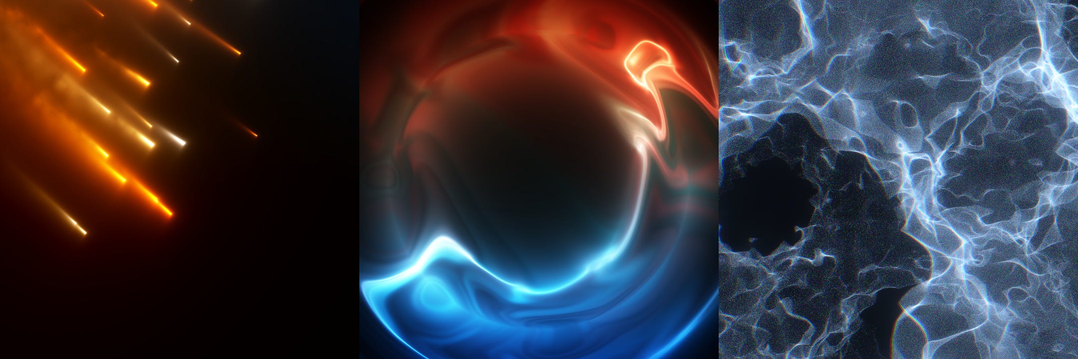
In my opinion, the most important design consideration is the composition. I’m talking about where the viewer's focus is. The placement and size of these focal points. Look at these 3 examples with a fancy sphere:

The first one is just awkward. It’s partially cropped, but also leaves a lot of empty space on the right. It feels out of balance. If there was something to look at on the other side, it might be acceptable, but for a single abstract object, on an empty scene, it’s not pretty.
The second one fills the screen pretty well and is horizontally centered. It’s out of balance vertically, with details below and empty above, but it feels intentional. It could work well as a slow, animated background.
Finally, the third is simple, perfectly balanced, and focused dead center. I think this works best for more complex shapes, fast animations, or with simple backgrounds. It immediately communicates where the focus should be. Our brains want to see the most flashy, vibrant, or fast things because they provide us with the most information, and we don’t like it when we cannot fully see it.
So the key points to consider are the focus points and composition balance. Aim to keep the main focus areas roughly in balance or clearly, intentionally out of balance (like the second example). Subtle, slower, and more immersive shaders can get away with showing less or having a moving focus (more on that later). Complex or animated objects should generally be fully in view. In more organic/fluid scenes, a Rule of Thirds might work better, but in any case, think about what is visible, the negative space, and what is being cropped out. Be intentional with the composition!
2 - Lighting
The next most important consideration, in my opinion, is the lighting, black/white level, and contrast. It’s a good idea to look at your shader under a histogram, if possible. I use GIMP and this gives a sense of the range of the value (“lightness”), in your shader:

You generally want to spread across the entire range of lightness from black to white, since using the full spectrum gives you the richest contrast. Typically, I aim to spread across most of the spectrum, and then if I need the image brighter or darker, I adjust the lightness distribution with Gamma. Squaring the color makes it darker and more vibrant. The sqrt of a color will make it whiter and softer.
If you’re dealing with anything bright, I highly recommend tonemapping, which helps prevent overexposure and washed-out colors. I wrote about that in detail here:

3 - Colors
My third consideration is coloring: saturation, color temperatures, hues, and palettes.

I am a big fan of color, and I tend to prefer vibrant shaders, but not every piece of art should be juicy. Grayscale works well for industrial styles, perhaps with a touch of chromatic aberration. Vibrant colors work well for abstract, psychedelic styles. Saturation is a good way to convey energy and use color temperature intentionally!
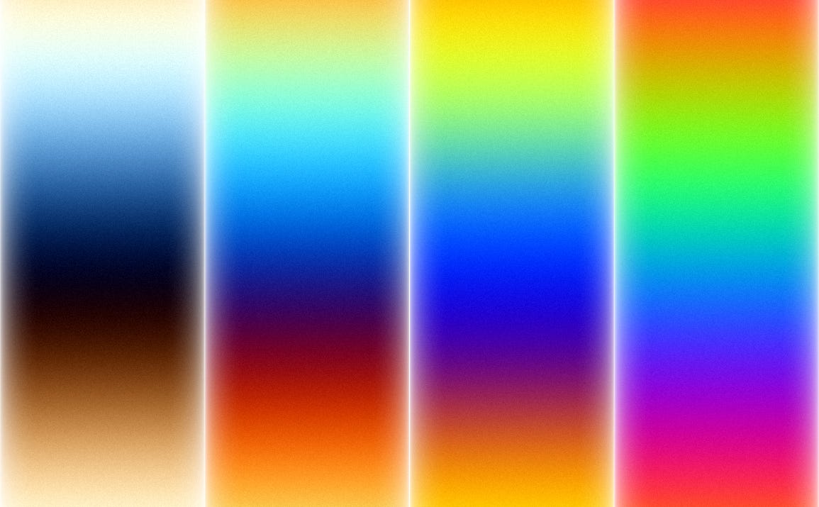
For color palettes, I like to use sine waves with separate phases for the RGB color channels. Iq has a nice example of the various palettes you can make with this.
My personal favorites are:
//Fun palletes to try
//Hue is in radians so the range is [0, 6.2831]
vec3 temperature1 = 0.5 + 0.5 * cos(hue + vec3(0.0, 0.5, 1.0));
vec3 temperature2 = 0.5 + 0.5 * cos(hue + vec3(6.0, 1.0, 2.0));
vec3 rainbow1 = 0.5 + 0.5 * cos(hue + vec3(0.0, 2.0, 4.0));
vec3 rainbow2 = 0.5 + 0.5 * cos(hue + vec3(0.0, 1.0, 3.0));
Here’s what these palettes look like:
One more trick: color gradients. You can make shaders significantly more interesting by adding a gradient to the image’s hue or saturation. Here’s an example with a red radial gradient overlayed on an unsaturated scene:
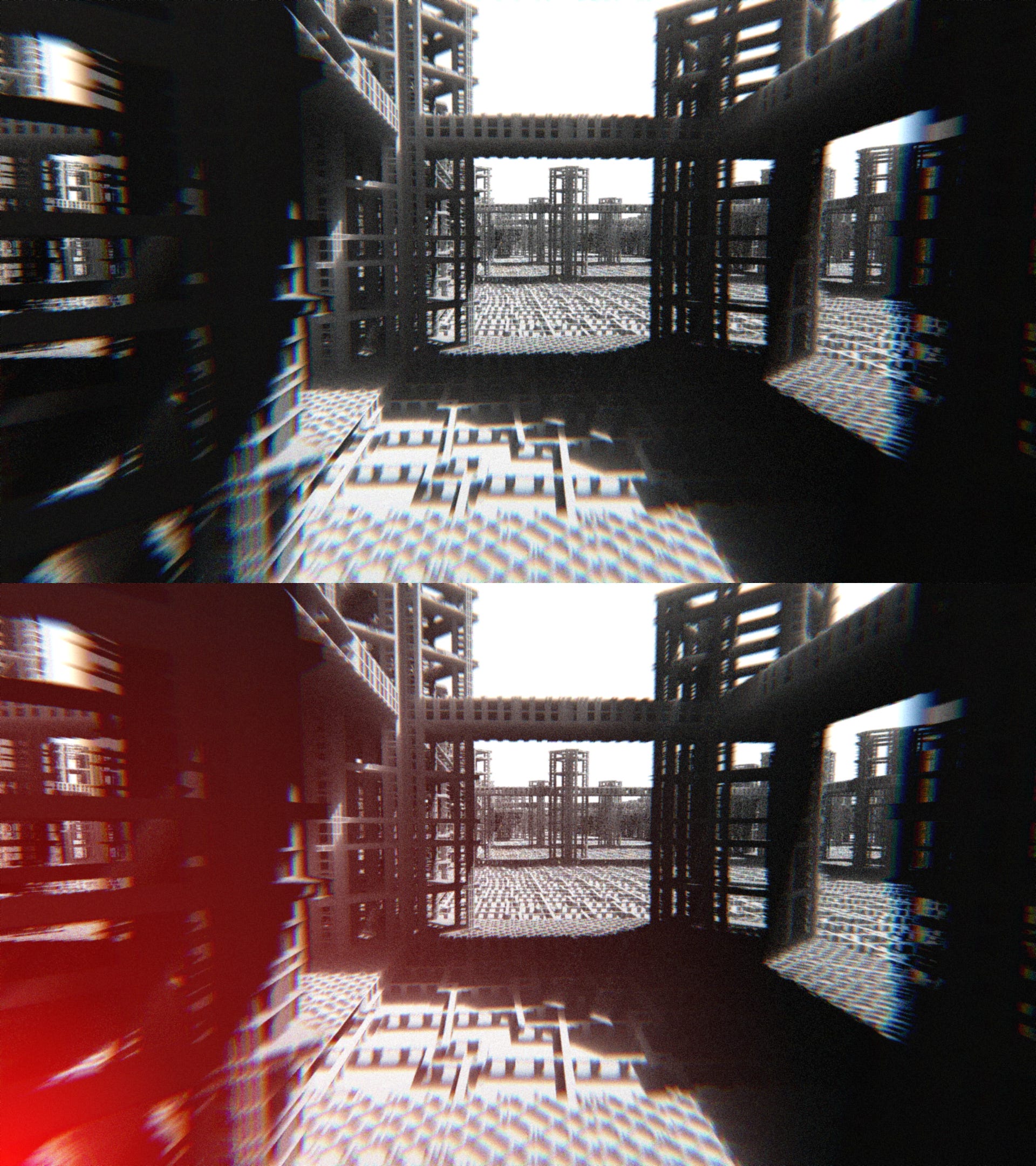
In this case, I am screen blending a red on top of the scene. You could also use a depth gradient for a fog-like effect. Get creative and play around with different positions, shapes, sizes, and colors. I tend to prefer red-blue diagonal gradients, but maybe you’ll find something cooler!
4 - Textures
Pay attention to details at various scales:

Our brains like fractals, perhaps because they tickle our brains at multiple levels. It’s certainly more interesting to look at an image that has both large-scale texturing and fine texturing. This can be achieved with fractal noise, turbulence, or fractal texturing.
In any case, it’s a good idea to take a step back and look up closely. If it’s interesting in those cases, you’re probably on to something! Again, this is highly subjective and won’t be important for all types of art, but it’s worth considering!
5 - Motion
And finally, look at the motion: speed, rotation, shape shifting, color shifting, etc. Here’s my sunset shader at two vastly different speeds:
I put this one last because I think it is probably the most subjective consideration, but still worth discussing. I love slower animations. Sometimes, graphics people animate too quickly (in my opinion) and start to show patterns in the animation. With the cloud example above, I think the extra speed reveals how artificial the motion actually is.
Try your shader 50% faster and 50% slower and see which you prefer. Background shaders should generally be slower, abstract shaders faster, and glitch/strobe shaders may need to be super fast. Just like the fractal texturing concept, you can also layer motion at multiple time scales. For example, colors could shift slowly while shapes may shift more rapidly. In 3D contexts, you may have a scrolling or twisting camera. It’s far more likely that you will make the camera go too fast than too slow, but again, play around with various speeds and see what works best.
Conclusion
Okay, that covers all the design decisions that I feel are most important to consider when creating animated art. Let’s do a quick recap:
Composition - Generally, you want to keep the designs focused in the center and roughly balanced on all sides. If you’re going for an unbalanced look, make it clearly intentional and lean into it!
Lighting - Generally, use bright lights and deep shadows. Strong contrast is a great way to make the richest display possible. Use the full range and tweak the gamma as needed. There are exceptions, but most art benefits from a wider range.
Colors - Play with saturation, color temperature, and palettes. Limited color palettes are often better than using all the colors. Color gradients are a great way to add large-scale character to your art!
Textures - Pay attention to both the fine details and the macro scale. It should look good at a glance and up close, if possible!
Motion - Test your art at multiple speeds and see what looks best. Background scenes should be more subtle, and abstract scenes can be more intense. Most people add too much speed, in my opinion! It’s good to mix elements at various speeds!
Hopefully, this gives you some ideas to try with your next piece. I would love to see what you guys come up with. Feel free to tag me!
Have a great night! Thanks,
-Xor
Great Article!